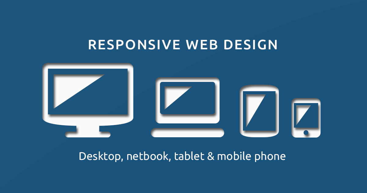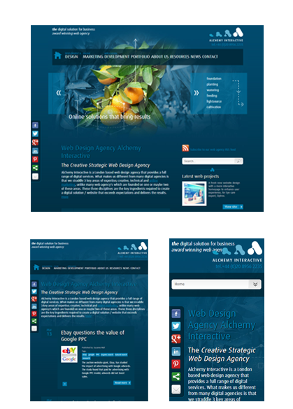
Creating a responsive web design takes a lot skill. It’s not just about making the content fit a smaller window. It’s about delivering a solid user experience to a growing number of web-enabled devices.
Yesterday web design talked about creating entirely separate device experiences, but this simply isn’t scalable in the long run. Creating adaptive experiences is a the more intelligent way forward, but this approach comes with it’s challenges.
Famous Quotes about Responsive web design
“If you don’t embrace the inherent fluidity of the web, you’re not a web designer, you’re something else. Web design is responsive design, Responsive Web Design is web design, done right.”
Andy Clarke
“[The web] should be accessible from any kind of hardware that can connect to the Internet: stationary or mobile, small screen or large.”
Tim Berners-Lee
To help you along the way, we’ve put together some Do’s and don’t of responsive web design to get you started:
Responsive Web Design Do’s
- Design with the user in mind – any look to develop a design which optimises the experience
- What device are they using
- What are they trying to achieve
- Do keep page size to a minimum using best performance based practices
- Design using the fluid grid - it was the original proposition for how RWD should work and it got support from Adobe. The fluid grid is when page elements are sized in relative (%) units and the number of grid columns change depending on the width limits.
- Do check out what’s above the fold on different devices as you’ll find ‘once size doesn’t fit all’
- Design for each device individually - A phone is not a tablet is not a laptop is not a desktop is not a TV, and they all have their own characteristics that you need to be aware of and design for.

Responsive Web Design Don'ts
- Don’t penalise users for the device they happen to be browsing with.
- Don’t hide content from mobile users - change the content to make it accessible to all
- Don’t clutter the design and add unnecessary items – ask yourself “is it necessary to the user – does it add anything’
- Don’t over bloat pages for mobile users – remember 74% of mobile users will leave after 5 seconds of waiting for a page to load, and the unfortunate reality is that only 3% of small screen versions of responsive sites are significantly lighter than their large screen counterparts. That means users bear the burden of a potentially massive download.
- Don’t make text links so small that they can’t be clicked on when browsing using a mobile device.
Creating websites that adjust to different screens and devices is just the beginning. Partner with us to create adaptive experiences that meets the needs of your users in every sense. Call us on 020 3078 6725 for a fresh approach.
See also:
Responsive web design
Web design
